All of the constructs that we have looked at so far have assumed a Picture Plane that is perpendicular to our line of sight. The Observer's Point of View has been directly in front of the rendering, and more or less agrees with the Central Vanishing Point in the perspective. What if the Picture Plane is Not square to the Observer, if it is angled ot tilted in some way? Or if the Observer's Viewpoint is well outside the frame of the rendering? It is still perfectly possible to create a perspective rendering that will look correct from that Viewpoint, but will be distorted when viewed from a perpendicular position.

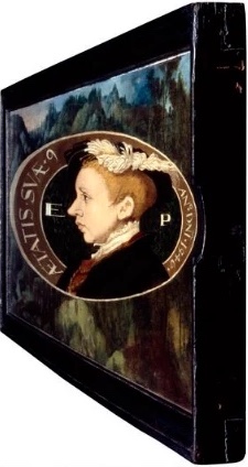
William Scrots: Portrait of Edward VI, 1546, National Portrait Gallery, London
https://www.npg.org.uk/collections/search/portrait/mw02032/King-Edward-VI
William Scrots' Portrait of Edward VI is barely recognizable as a human face. Note the gap in the right side of the picture frame. Viewed from the gap, the portrait is Foreshortened to correct the distortion.
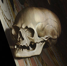
Hans Holbein's The Ambassadors is an even earlier example. It actually has two Points of View in the same rendering. Holbein has rendered the ambassadors using a predictable frontal perpendicular Picture Plane, but then renders a skull onto a Picture Plane that is at an extreme angle. We are right back to the beginning precepts of Linear Perspective, which located the Observer in a specific position. Except now there are two Observation Points. Viewed from the frontal Observation Point, the ambassadors are comprehensible and the skull is nonsense. And viewed from the angular Observation Point, the skull resolves itself into a recognizable object, and the ambassadors become hopelessly distorted.
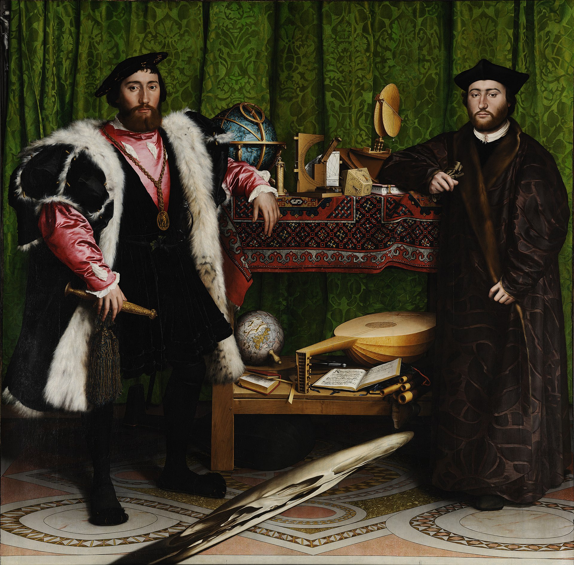
Hans Holbein: The Ambassadors, 1533, Natioanl Gallery, London
https://www.nationalgallery.org.uk/paintings/hans-holbein-the-younger-the-ambassadors
So far, in our discussion about the Picture Plane, we have positioned it in front of the subject of our rendering: a window through which to view the scene. The Picture Plane is of course theoretical construct, so if it is possible to place it at an angle, it is just as possible to place the Picture Plane behind the subject. Compare the two illustrations below, developed from the same Ground Plan, but with different Picture Planes. Note how the rendering becomes larger, more dynamic. As well, the rendering is now focussed on the most important part of the scene. All the surrounding dead air has been eliminated. And just as importantly, since distortion is worst at the periphery, most of that has been eliminated as well. Note that the canvas will have to be extended to accommodate the new larger rendering.
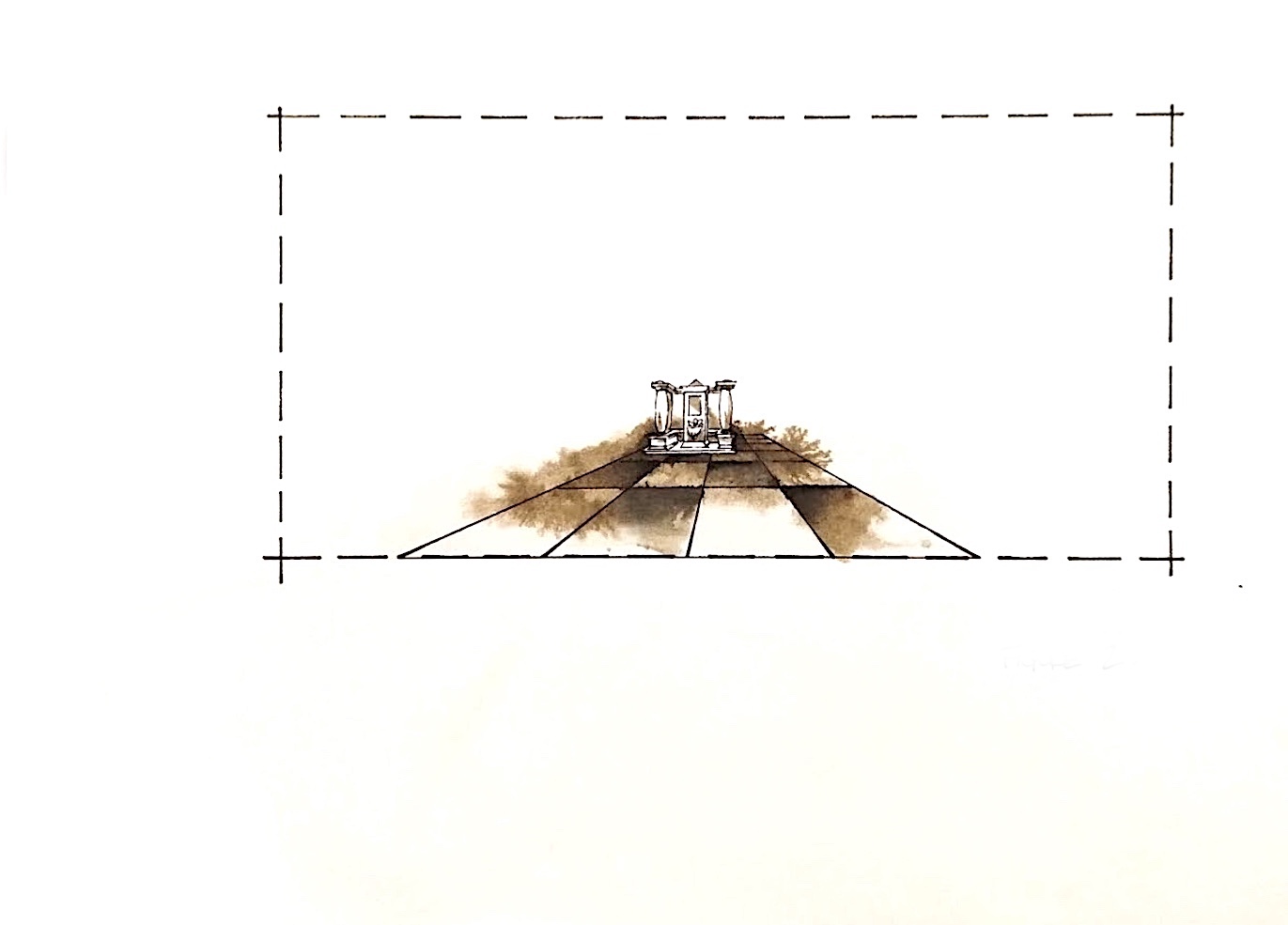
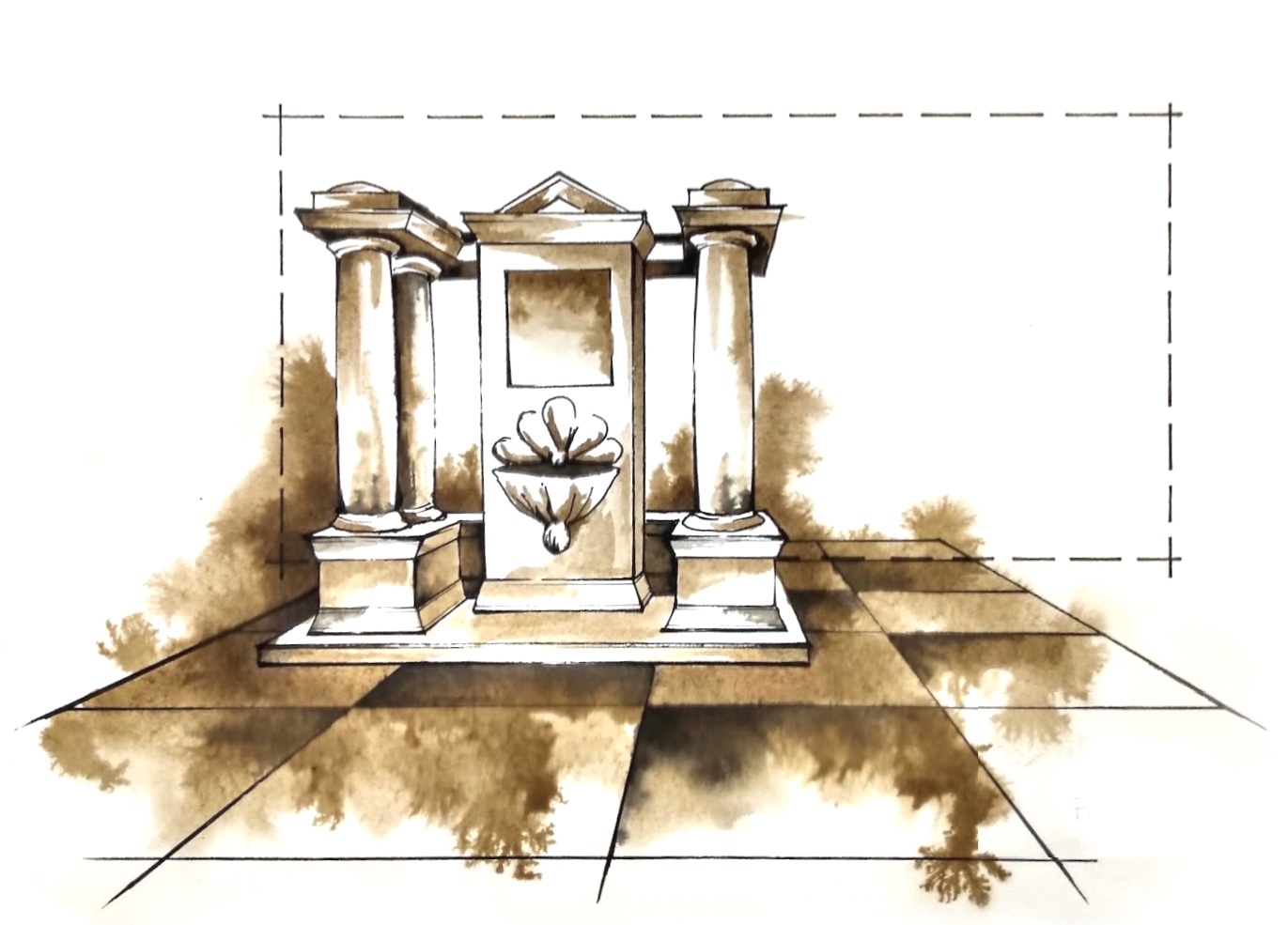
Ronald Fedoruk: Liberating the Picture Plane,
Theatre Design and Technology, Vol. XXVIII, No. 5, Fall 1992, pp. 39 - 41
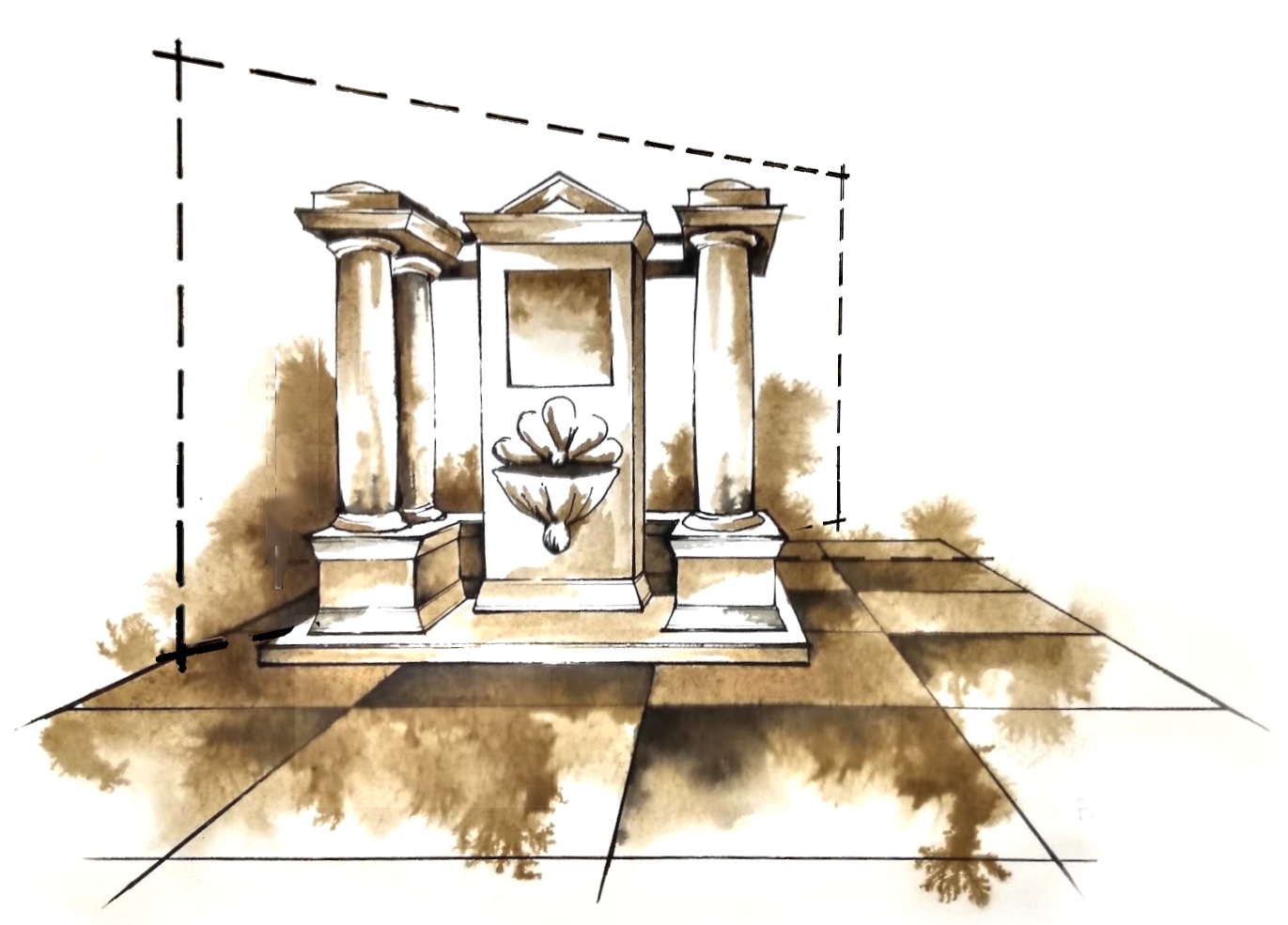
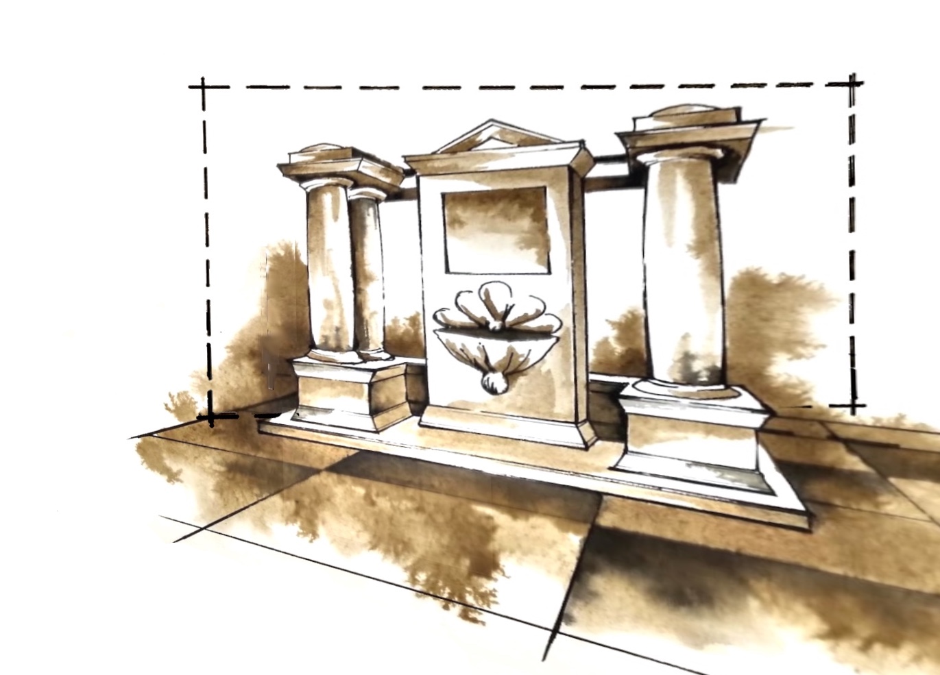
This rendering can also be projected onto an angled Picture Plane to create an Anamorphic image. And then if the Observer shifts to a different Veiwpoint, such as perpendicular to the new Picture Plane, the image will be distorted. In all other applications of perspective we have recognized the distortion, tried to eliminate it. Anamorphosis actually embraces, manages and exploits distortion.
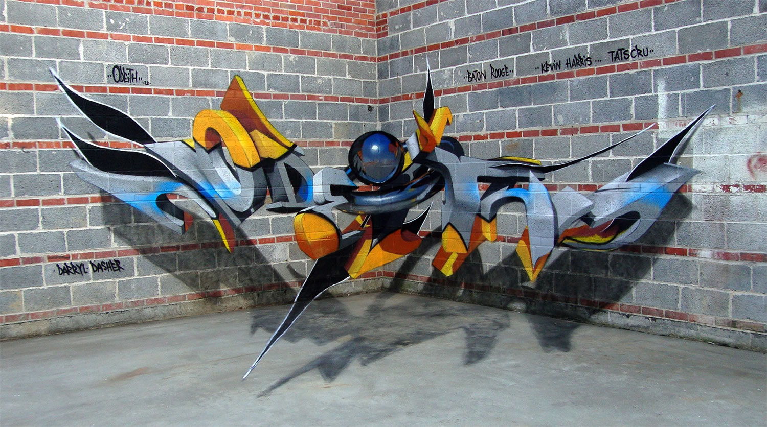
Sergio Odeith is a Portuguese street artist who carries this a step further. He uses the corners of a space to create Anamorphic Street Art. Instead of one angled Picture Plane, there are at least two, meant to be viewed simultaneously from a single Viewpoint. If the two vertical Picture Planes are not big enough, Odeith simply extends the image onto a third, horizontal Picture Plane - the floor. We are so accustomed to seeing painted art on a flat canvas, and this image is so unlike anything we have ever seen before, we have trouble comprehending it. The image seems to uncouple itself from the surface. But in reality it does not hover in space. The tag and all its shadows are painted.
Istvan Orosz creates renderings that can be viewed comprehensibly from our expected Viewpoint, but a second Viewpoint, only possible using a cylindrical mirror, reveals a second, completely different image rendered in Cylindrical Perspective. In the 18th Century in England, Anamorphosis became a political tool used by Jacobite sympathizers to recognize one another. A nonsensical painting viewed in a cylindrical mirror revealed a portrait of Bonnie Prince Charlie.
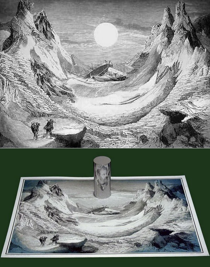
Istvan Orosz: Mysterious Island / Jules Verne, 1983, Private Collection
https://www.famousgraphicdesigners.org/istvan-orosz
Michael Murphy's work takes Anamorphosis into the realm of sculpture. Each separate piece of plastic in this sculpture is its own individual relationship to one Picture Plane, all of them meant to be viewed simultaneously from one Observation Point. If the Observation Point or the Picture Plane are changed, all those relationships change, and the whole thing dissolves.
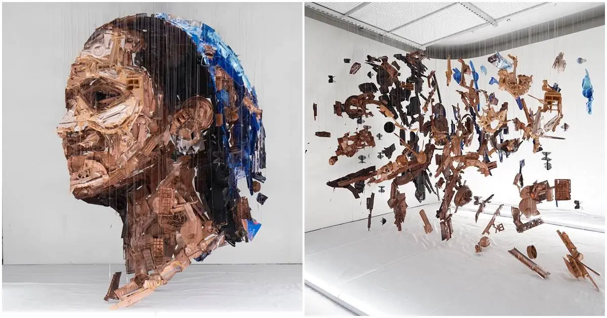
Michael Murphy: Dolly, 2019, Recycled plastic, Borough Market, London
https://www.perceptualart.com
We have previously discussed several forms of Perspective co-existing in the same rendering. All is well as long as the various constructs agree with one another. Anamorphosis purposely creates a discontinuity among the constructs. And this causes us some confusion. In 1946, Adelbert Ames created an Anamorphic room, now called an Ames Room. His purpose was to compare preconception, perception and reality. Here the Linear Perspective is at odds with the Diminution of the figures in the space. The room looks correct from only one Observation Point; any deviation from that point will create the kind of distortion we have seen in other examples. Even though we know the room is manipulated and even though we know full well that two people cannot be this disparate, our first response to the image to trust the illusory Linear Perspective and discount the more trustworthy Diminution. Ames was obviously right to want to question preconception.
