


Perspective of Colour
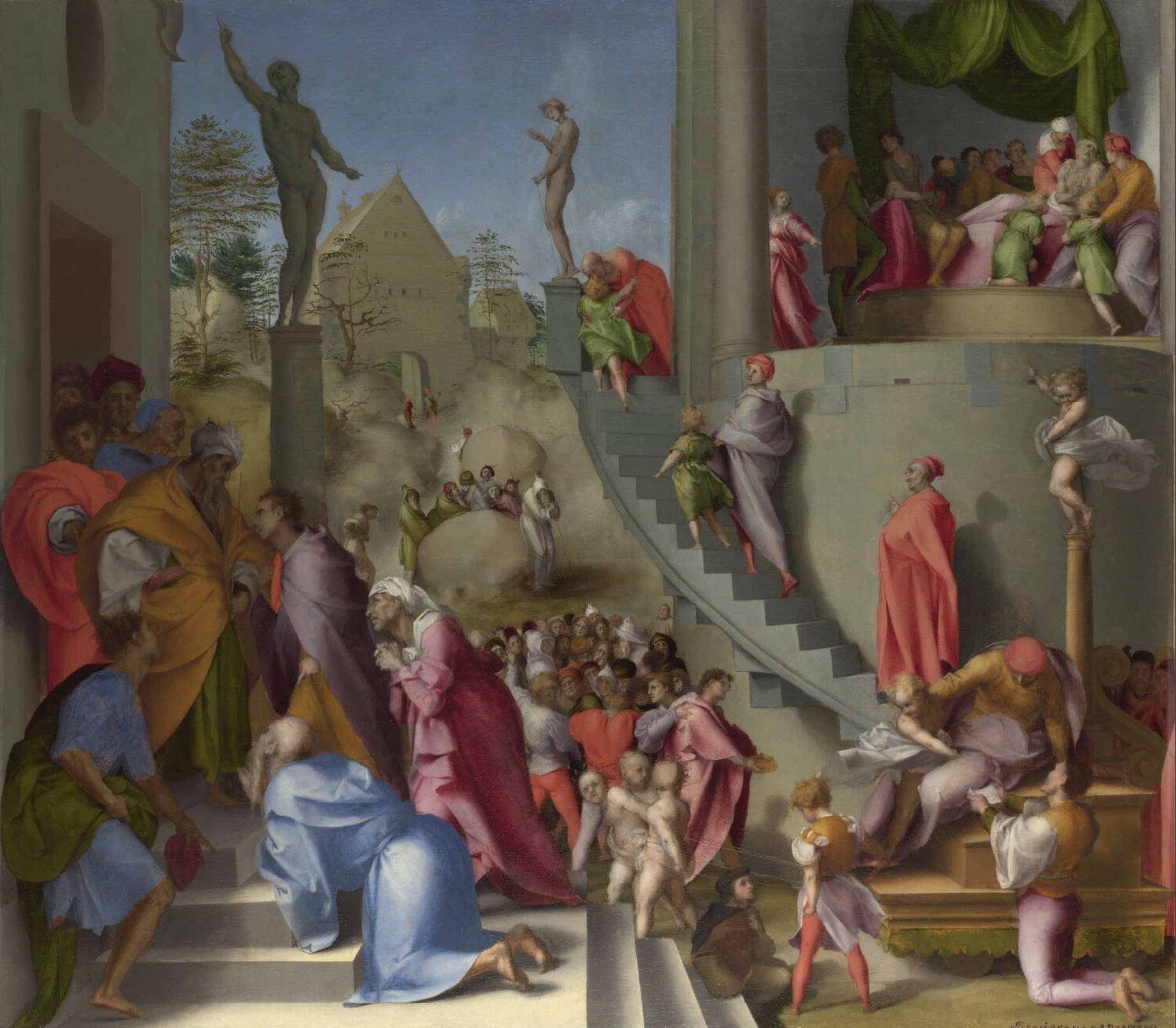
Leonardo's Perspective of Colour also recognized that highly saturated colours tend to advance towards the observer, while muted or less saturated colours tend to recede into the background. It is a trick of the eye that Jacopo Pontormo exploits in his Joseph with Jacob in Egypt. And Michelangelo uses in his frescoes in the Sistine Chapel.
Jacopo Pontormo: Joseph with Jacob in Egypt, 1515, National Gallery, London
https://www.nationalgallery.org.uk/paintings/pontormo-joseph-with-jacob-in-egypt
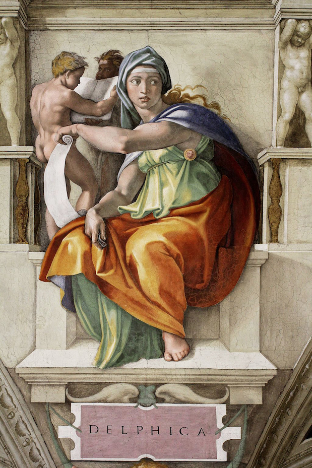
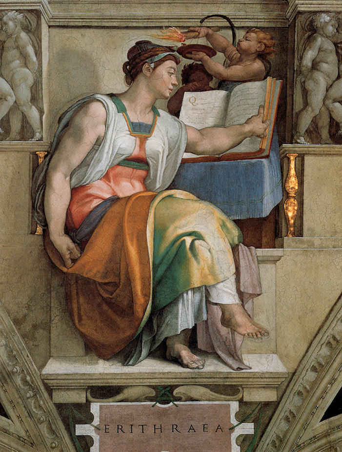
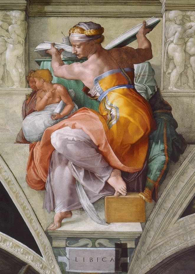
Michelangelo Buonarotti: Sybils (Details), 1512, Sistine Chapel, Vatican
https://smarthistory.org/michelangelo-ceiling-of-the-sistine-chapel/
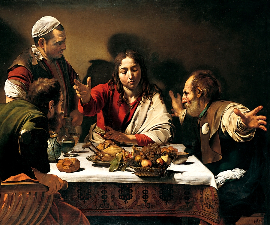
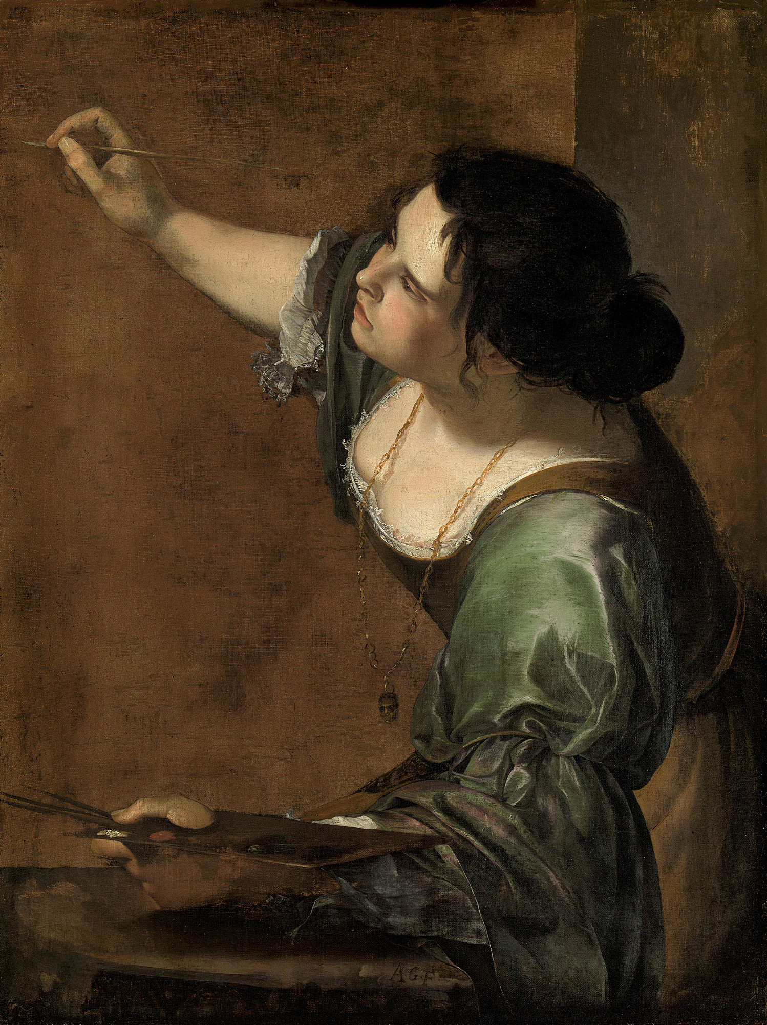
Lighter values also appear to advance toward the observer while darker values tend to recede. This is an illusory tool that Caravaggio and Artemisia Gentileschi both used to give their paintings depth. Note in both cases the shadows on the wall that define the size of the room.
Michelangelo Merisi da Caravaggio: Supper at Emmaus, 1601, National Gallery, London
https://simple.wikipedia.org/wiki/Christian_art#/media/File:Caravaggio.emmaus.750pix.jpg
Artemisia Gentileschi: Self-Portrait as the Allegory of Painting (La Pittura), 1638-39, The Royal Trust Collection, London
https://www.rct.uk/collection/search#/1/collection/405551/self-portrait-as-the-allegory-of-painting-la-pittura
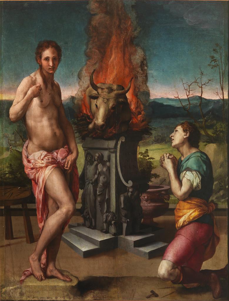
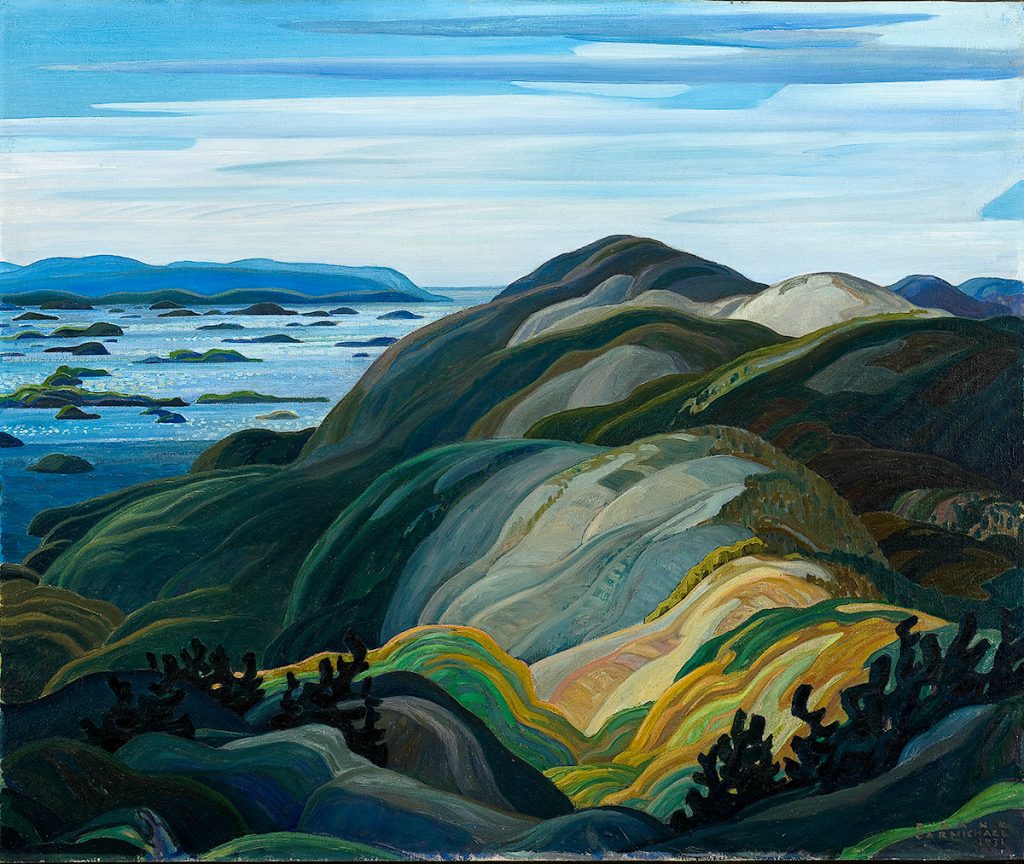
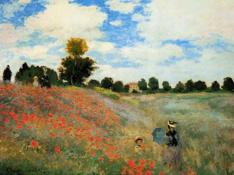
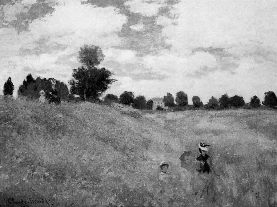
In a similar manner, Red and Yellow hues advance while Blue and Green hues recede. Bronzino's Pygmalion is a less than subtle example. But four hundred years later, Franklin Carmicheal would use the effect in his abstract landscapes. Claude Monet found an even more satisfying use of the device, making his poppies bounce out at the viewer. And indeed it is colour that creates the effect. Without colour, his poppies simply disappear.
Agnolo Bronzino: Pygmalion and Galatea, ca. 1550, The Uffizi Gallery, Florence
https://www.virtualuffizi.com/pygmalion-and-galatea.html
Franklin Carmichael, Bay of Islands from Mt. Burke 1931, McMicheal Canadian Art Collection
https://commons.wikimedia.org/wiki/File:Franklin_Carmichael_-_Bay_of_Islands_from_Mt._Burke.jpg
Claude Monet: The Poppy Field near Argenteuil, 1873, Musee d'Orsay, Paris.
https://www.claude-monet.com/the-poppy-field.jsp